
The most reliable holiday lighting color schemes share one rule: warm white as the structural base, with a single accent color layered on for personality. The strongest combinations for 2026 are warm white alone, red and green, blue and cool white, gold with a single accent, and purple and teal for a nontraditional look. Limit each zone (roofline, trees, shrubs) to two or three colors, and never mix palettes across zones. The palettes below show exactly how to apply that rule to your own roofline, trees, and garland.
TL;DR:
- Limit each zone to two or three colors, with warm white as the foundation, to maintain a cohesive and non-cluttered display.
- Match the color temperature of bulbs to your exterior materials, using warm white for brick and beige siding, and cool white for gray stone and modern finishes.
- Opt for monochromatic schemes like warm white or gold for luxury properties, while controlled multicolor should be confined to trees and garland, not the roofline.
- Use uniform bulb types and keep whites consistent across runs to prevent mismatched colors and visual clashes in the display.
- Consider permanent smart lighting systems to easily reproduce the same color schemes yearly without ladder work or bulb replacements.
Table of Contents
- Holiday Lighting Color Schemes You Can Copy Tonight
- How to Choose a Color Scheme for Your Property
- Bulb Types, Lens Styles, and Color Temperature by Zone
- What’s Trending in Holiday Lighting for 2026
- Common Color-Scheme Mistakes and How to Fix Them
- The Psychology Behind Holiday Lighting Colors
- Matching Lighting Color to Your Outdoor Decorations
- Real Displays That Show These Palettes Working
- When Permanent Lighting Makes Color Decisions Easier
- A Direct Path to a Finished, Ladder-Free Display
- Sources
Holiday Lighting Color Schemes You Can Copy Tonight
Every palette below follows the same structural logic: warm white does the heavy lifting, and color gets used with intention rather than volume. Designers who plan professional displays zone color by structure, treating the roofline as one decision and the trees as another, which is why the strongest home displays never look like a single idea repeated everywhere.
- Warm white only. Roofline in C9 warm white, trees wrapped in matching 5mm minis. This is the safest, most resalable look and works on brick, stone, or vinyl siding without clashing.
- Red and green. The most recognized holiday pairing remains popular for a reason. Run red along the roofline in C9 bulbs, green through shrubs or garland, and let warm white connect the two zones on porch posts or railings. This combination still tops most color combination guides for a reason: it reads as “Christmas” from the street in half a second.
- Blue and cool white. A modern, wintry look suited to stone or gray siding. Use cool white (5000K or higher) on the roofline and blue minis in trees. Skip this on homes with warm brick, since the temperature clash will fight the material.
- Gold and warm white. A monochromatic, upscale look popular with luxury properties and increasingly common on residential facades. Gold rope lighting along trim with warm white C9s on the roofline reads as understated rather than seasonal clutter.
- Purple and teal. A nontraditional pairing gaining ground for homeowners who want a display that stands out on a street full of red and green. Works best on modern architecture with dark trim.
- Amber and deep red. A sunset-inspired combination that photographs exceptionally well at dusk, especially against darker rooflines.
- Controlled multicolor. Classic red, green, blue, and gold together, but only on trees or garland, never on the roofline. Keep the roofline warm white so the display has a visual anchor.
- Icy white and silver. All-white with subtle silver-toned accents on shrubs, ideal for a minimalist winter theme that carries past the holidays.
- Orange and warm white. An early-season or Thanksgiving-adjacent option that transitions cleanly into December red and green.
- Champagne mixed white. A tuned blend of warm and cool white designed specifically to look cohesive rather than mismatched, a workaround for homeowners who like the crispness of cool white but not its clash with warm brick.
On a smaller home, one palette across the whole facade (say, warm white with a red accent on the door surround) reads clean and finished. On a larger property, split zones: warm white roofline, a single accent color in the trees, and garland that repeats whichever accent you chose rather than introducing a third color. Forever Glow Lighting’s color-changing landscape and permanent holiday lighting project in Charlotte shows this zoning principle applied across a full property line.
How to Choose a Color Scheme for Your Property
- Match color temperature to your exterior materials first. Warm white flatters brick, wood, and tan or beige siding. Cool white suits gray stone, modern black trim, or contemporary builds. Get this wrong and even a well-planned palette will look slightly off.
- Assign one palette per zone, not per bulb. Roofline, trees, shrubs, and garland each get their own color decision, but every zone should share a connecting element, usually warm white.
- Cap each zone at two or three colors. More than that and the display stops reading as a scheme and starts reading as noise.
- Factor in maintenance and energy use before you commit. LED strings last longer and run cooler than incandescent, and ENERGY STAR’s LED guidance is a useful baseline if you’re comparing bulb quality across brands.
- Check your HOA guidelines or neighborhood norms. Some communities restrict colored lighting to certain dates or limit animated or flashing displays. A quick call avoids a display you have to take down early.
- Test on one section before committing the whole house. Wrap a single tree or one roofline run in your chosen palette, look at it after dark for two or three nights, and adjust before buying enough product for the entire property.
Commercial and luxury properties tend to lean monochromatic warm white or gold for a cohesive look, while venues built around events often use programmable RGB systems to run animated color scenes. The same logic scales down to a single house: know whether you want a static, elegant look or a dynamic one before you buy bulbs.
Bulb Types, Lens Styles, and Color Temperature by Zone
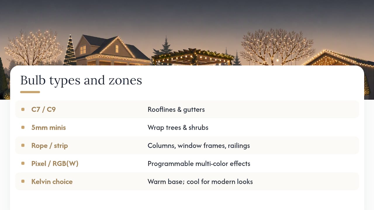
The palette only looks as good as the hardware behind it. C7 and C9 bulbs make bold, individually visible statements and are the standard choice for roofline and gutter runs. 5mm mini lights disappear into dense foliage, which is why they’re the default for wrapping trees and shrubs. Rope and strip lighting hug architectural lines like columns, window frames, and railings. Pixel, RGB, and RGBW systems add programmable color, letting one installation cycle through multiple palettes over the season.
Pro Tip: If you’re mixing warm white with any accent color, buy from the same product line so the “warmth” of the white matches across bulb styles. A C9 warm white and a 5mm warm white from different manufacturers can read as two different colors side by side.
Kelvin choice drives the whole look. Use warm white as your base color almost everywhere, and reserve cool white for homes that want a deliberately modern, icy aesthetic. Professional installers standardize both bulb type and Kelvin temperature within a single run, using uniform C9s across an entire roofline rather than mixing styles.
Mixing warm and cool white on the same run is the single most common mistake homeowners make, and it’s the fastest way to make an otherwise good palette look accidental rather than planned. If you want the crispness of cool white without the clash, ask about a champagne-toned mixed white, engineered specifically to blend the two temperatures. Mismatched lens shapes and bulb spacing cause the same problem visually, so match both across an entire run, not just the color.
What’s Trending in Holiday Lighting for 2026
Warm white as a structural base is now the most-requested color temperature among professional installers, according to industry trend surveys for 2026. Sunset-inspired palettes such as amber, deep red, and gold are showing up more often as homeowners move away from primary-color combinations toward warmer, moodier tones.
Permanent, smart color-changing systems are also on the rise. Commercial and residential installers report growing demand for RGB and RGBW setups because one physical installation can support dozens of seasonal palettes without swapping a single bulb. The broader shift is toward restraint: fewer colors, better cohesion, and a “less is more” approach that favors one well-executed palette over a dense, chaotic mix of everything at once.
Common Color-Scheme Mistakes and How to Fix Them
Pro Tip: Pick one accent color and use it sparingly. Warm white does the structural work; the accent color is there to add personality, not compete for attention.
The three mistakes that show up most often on residential displays: mixing warm and cool white on the same run, mixing bulb styles (C9s next to minis on the same line), and using more than three colors in a single zone. Each one is fixable without buying an entirely new setup. Re-zone the display so each area gets one clear color decision. Swap mismatched strings for a uniform bulb type and spacing. If your whites clash, dim the cooler string slightly or replace it with a tuned mixed white that’s built to blend rather than fight.
The Psychology Behind Holiday Lighting Colors
Color choice shapes how a display feels before anyone consciously registers why. Warm white and gold read as cozy and traditional, evoking candlelight and hearth, which is a highly requested base tone among professional installers. Red and green trigger immediate holiday recognition, an association built over decades of retail, film, and greeting card design, so they tend to feel the most “festive” even to viewers who couldn’t articulate why.
Blue and cool white shift the mood toward calm and modern, sometimes even wintry rather than explicitly festive, which is why they suit contemporary architecture better than traditional brick colonials. Purple and teal read as playful or artistic, a signal that the homeowner wanted something distinct rather than expected. Multicolor displays, when controlled and zoned well, read as energetic and welcoming. When uncontrolled, with too many colors packed into one run, they tend to read as cluttered or overwhelming rather than joyful, which is the visual root of most complaints about “too much” holiday lighting.
The practical takeaway: pick your emotional target first, cozy, modern, playful, or festive, and let that decision determine your palette rather than defaulting to whatever combination is easiest to buy in bulk.
Matching Lighting Color to Your Outdoor Decorations
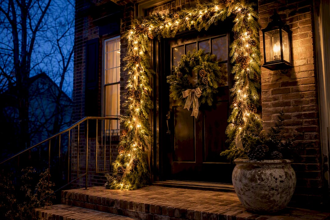
Lighting color and physical decorations need to agree, or the whole display reads as disjointed no matter how good each piece looks individually. A warm white and gold lighting scheme pairs naturally with natural garland, pinecones, and neutral ribbon, while a red and green palette calls for classic wreaths and traditional ornaments rather than metallic or pastel accents.
Inflatable decorations and character displays tend to demand brighter, more saturated colors nearby, since a subtle warm white base can get visually lost next to a large lit inflatable. If your yard leans traditional, with a nativity scene or classic wreaths, keep the lighting palette equally traditional: red, green, and warm white. If your display leans modern, with geometric wreaths or minimalist wire ornaments, cool white and a single accent color like blue or silver will feel more cohesive than a busy multicolor scheme.
The color wheel relationships that govern lighting palettes, complementary, analogous, and triadic combinations, apply just as well to ribbon, ornament, and wreath color. A home decorated with complementary red and green décor looks stronger with lighting that reinforces the same pairing rather than introducing a third, unrelated color. Seasonal interior trends can offer useful direction here too. Seasonal color and pattern choices in home decorating often echo the same restrained, cohesive palettes that work best outdoors.
Real Displays That Show These Palettes Working
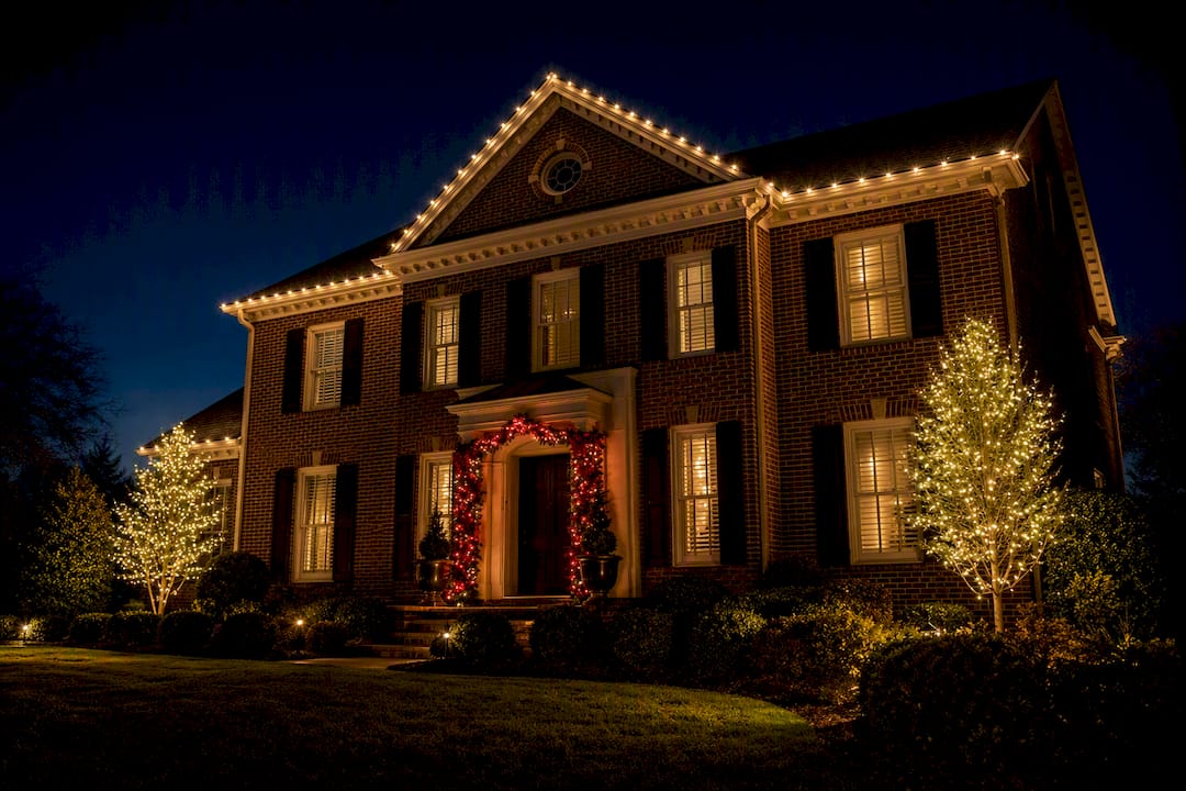
A modest brick colonial with warm white C9s on the roofline, matching 5mm minis in two flanking trees, and a single strand of red garland lighting on the front door surround demonstrates the one-palette-per-zone rule at its simplest. Nothing competes for attention, and the red accent reads as intentional rather than accidental.
A larger stone-and-siding property benefits from more zoning. Cool white along a modern roofline, blue minis wrapped through ornamental trees near the entrance, and warm white bistro-style lighting on a covered porch or patio area create three distinct but complementary zones. This kind of layered approach, coordinating exterior finishes with fixture placement, is a technique also used in broader exterior remodeling, where coordinating outdoor living spaces with permanent fixtures ties different areas of a property together visually.
Commercial and luxury residential properties increasingly favor a monochromatic gold or warm white scheme across the entire facade, skipping color accents entirely in favor of consistency. It’s a look that photographs well specifically because there’s nothing competing inside the frame. A recent color-changing landscape and permanent holiday lighting installation in Charlotte shows how a single property can shift between a warm white everyday look and a color accent scheme for the holidays without any new hardware.
When Permanent Lighting Makes Color Decisions Easier
Choosing a palette is one problem. Maintaining it every year, without a ladder, without replacing burned-out bulbs mid-December, is another. Permanent smart lighting systems solve the second problem by letting homeowners store and recall exact color combinations from a smartphone app, which means the warm white base and the single accent color you settle on this year can be reproduced precisely next year, and adjusted instantly if a neighbor’s display or a new coat of siding changes what looks best. Some installations use RGBW LEDs with a dedicated white channel specifically to avoid the muddy or slightly off-color whites that plague cheaper RGB-only products.
— Dave
A Direct Path to a Finished, Ladder-Free Display
There are alternatives to seasonal string lights and yearly ladder work for homeowners who want the palettes described above without redoing the installation every November. The custom-installed roofline track holds its position year-round, invisible by day, and every palette in this guide, warm white base, red and green, gold and warm white, purple and teal, is available as a saved smartphone setting rather than a box of bulbs to untangle.
Some permanent lighting systems are HOA-compliant by design and built for weather resistance, so the color scheme chosen one year can remain unchanged the next. If you want to see how the process actually works before committing to anything, Forever Glow Lighting’s installation walkthrough covers the timeline and what to expect on-site. Contact providers for a free estimate and have your palette mapped to your actual roofline, not a generic template.
Sources
- Christmas Light Trends 2026: Customer Preferences & Market Analysis | Strandr Blog
- Top Commercial Christmas Lighting Trends 2026 | St Nick’s – St. Nicks Christmas Lighting
- What Colors Should I Use for My Christmas Light Show? | Learn Christmas Lighting
- ENERGY STAR